mcmillantranslation.com
Redesign
Client: Karen McMillan Tkaczyk
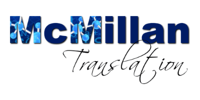
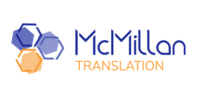
Karen is a freelance translator based in the US. Originally from the UK, the qualified chemist translates from French into her native English. She heard about me specializing in Divi, a WordPress theme by Elegant Themes that she already owned, but she didn’t really have the time to dig into the possibilities Divi offers. My job was initially to rework what she had to give her site a modern look. After a thorough briefing, we also decided to give her logo a makeover and essentially did a rebrand, too.
from
to
Her very first email to me read:
“I have a DIVI website but it’s just what I could manage on my own with my husband’s help to start with, and I could do with some professional help to polish it. Some of the existing site I plain don’t like, some I think is OK, and all of it could do with more pizzazz.
I’d be willing to get new photos or write new copy (which I’m bearable at but not great). What I’m no good at is design – creating a vision for how it could look. Might this be something you could help me with?”
So that is what we started with. I put together a catalog of questions, starting with her old logo and if she was happy with it. I wanted her to assess the structure of then existing site, especially regarding SEO. I saw a huge potential here. Since she is a translator, I assumed she could write, if she was given a script of sorts, and I asked her how comfortable she would be with that. I also inquired about her blogging strategy, which didn’t quite make sense to me. But after talking it through, I understood what her aim was and was able to help with that, too. Other questions dealt with her current client base and what she wanted it to be in the future.
Seems like a lot to get started? As I told Karen, I believe that design follows function. And therefore it was important to me to fully understand her wants vs. her needs.
In the end, we had a clearly structured website in French and English that perfectly balances images and whitespace and content. Meanwhile — and we are talking over a time span of more than half a year — Karen has fully identified with her new brand voice. The new logo adorns newly designed business cards, letterheads and her CV, which now is structured more like a profile to appeal to potential direct clients.
I am happy with how everything turned out and I am so grateful that I was chosen by Karen to help her with the redesign turned rebranding.

Project scope
- Rebranding
- Restructuring
- SEO
- Copywriting promts
- Business cards
- Social media assets
- Print materials and templates
Before
Home
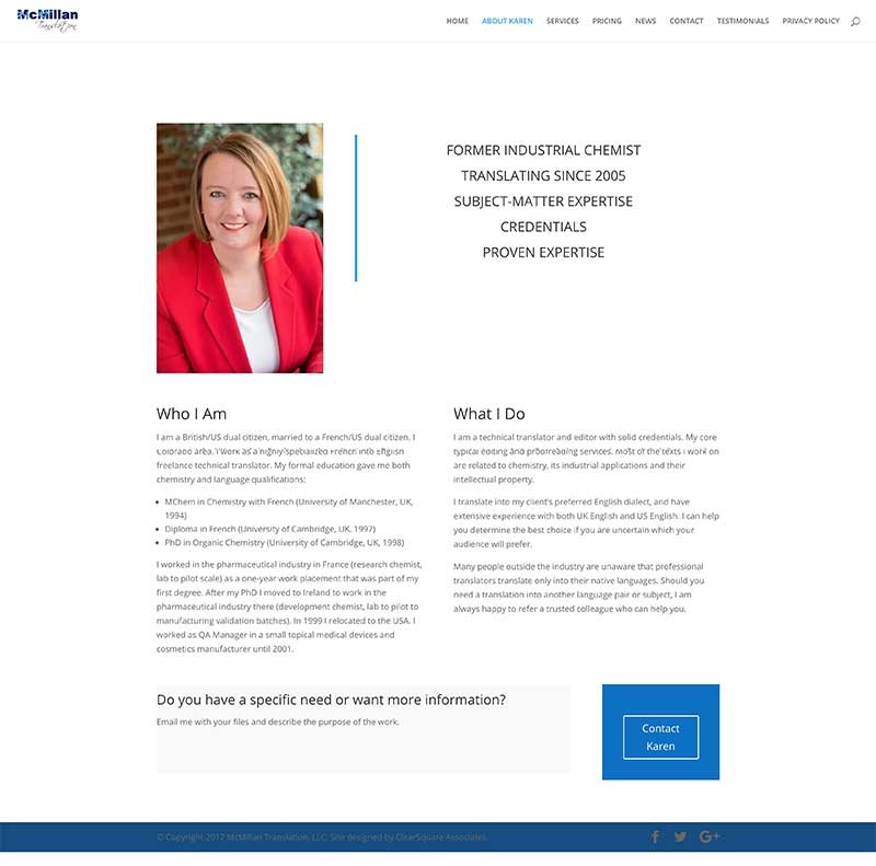
About
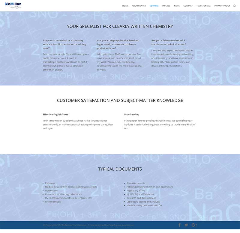
Services
After
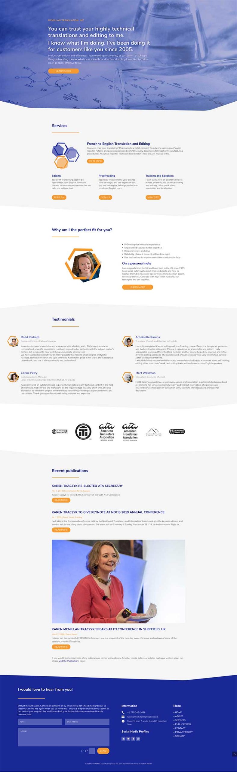
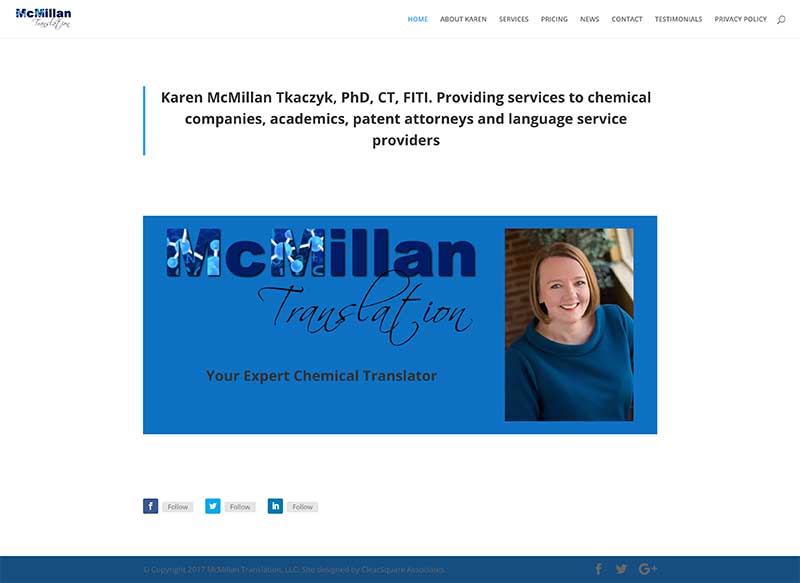
Home
Some more details
These are “before and after” screenshots of the website. Before we reworked the structure of Karen’s website, her website structure was pretty simple. There was a Home page that had very little content, her About page was a long list of achievements and explained who SHE is. Her Service page, again, was a long list of the kind of projects she works on.
After we restructured her website, her Home page became her information hub and leads visitors to other pages that go into detail for each topic. Today, her Home page not only features multiple strong calls to action that help keep visitors on her site, but also important testimonials, memberships, a contact form (which is present on every page), and her latest blog articles.
Everthing is wrapped in a consistent visual design (shapes, colors, fonts) and lends her website the professional appearance that Karen’s work and achievements deserve.